Real estate listings are a decent lie detector for design trends, because sellers only advertise what buyers actually want. By that measure the biggest shift in American interiors right now is color drenching. Zillow’s 2026 home trends report found the phrase showing up in listing descriptions 149 percent more often than a year ago.
What Color Drenching Actually Means
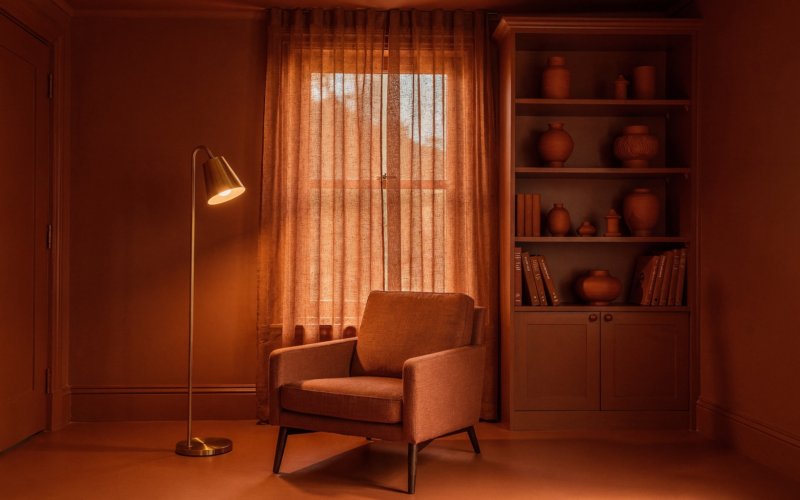
One color on everything. Walls, ceiling, trim, baseboards, door casings, sometimes the door itself, all in the same shade. The point is to erase the visual seams that break a room into parts.
It is not an accent wall and it is not a feature ceiling. Those approaches add contrast. Drenching removes it, and the effect is that a small room stops announcing its own boundaries and starts feeling deliberate.
Why It Works in Rooms That Fought You
White trim is a dividing line. In a room with awkward angles, a dormer, a low ceiling or six competing doorways, every one of those lines gets outlined in a contrasting color and the eye counts all of them.
Paint everything one tone and the counting stops. Small studies, hallways, powder rooms and attic bedrooms are the clearest wins, which is a mercy, because those are the rooms most people had given up on.
The Formal Dining Room Came Back With It
The same reporting that flagged drenching also flagged the return of rooms with jobs. The formal dining room, the study, the separate den. After fifteen years of knocking down walls, people are putting a few back.
This is not nostalgia. It is a correction. Open plan promised flexibility and delivered a single enormous room where somebody is always on a video call twelve feet from somebody watching television. A door turns out to be a feature.
How to Do It Without Ruining the Room
Match the sheen to the surface, not to the tin. A common approach is eggshell or matte on walls, satin or semi gloss on trim and doors, all in the identical color. Same pigment, different reflectance, so the architecture is still readable.
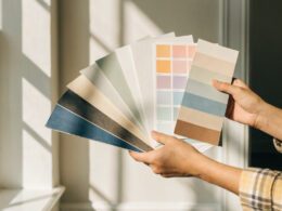
Get real samples on real walls and look at them at three different times of day. A deep color reads completely differently at 8am and 8pm, and a drenched room gives you nowhere to hide from a bad choice.
The Ceiling Is Where People Chicken Out
Almost everyone who tries this stops at the walls and trim, leaves the ceiling white, and then wonders why the room looks like a paint job rather than a design decision. The ceiling is the whole point. A white lid on a dark room draws a bright rectangle across the top of your sightline and puts the boundary right back where you were trying to erase it.
If a fully drenched ceiling feels like too much, there is a middle path that designers use constantly. Mix a small amount of your wall color into white to make a lighter version of the same tone, roughly a quarter strength, and use that overhead. You keep the continuity and lose some of the weight.
The other place people hesitate is radiators, built in shelving and window sashes. Paint them. Anything you leave in the old contrasting color becomes the loudest object in the room, and it will be the first thing every visitor looks at whether you want that or not.
Where It Goes Wrong
Two failure modes. The first is drenching a room with a lot of natural light and expecting drama. Bright rooms flatten deep colors into something merely dark, and you end up with a space that looks unfinished rather than cocooning.
The second is doing it in a wide open sightline. If your living room flows into a kitchen with no visual break, drenching one half creates a hard edge exactly where the trend is supposed to remove one. Pick rooms with doors.
The Colors Doing the Work
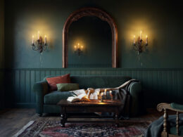
The palette is warm and saturated rather than cool and gray. Deep olive, oxblood, clay, ochre, ink blue, chocolate brown. This follows directly from the collapse of the gray era, which we wrote about when designers stopped being subtle about gray being finished.
Jewel tones are moving into bedrooms specifically, borrowed fairly openly from luxury hotel rooms, where the enveloping dark bedroom has been standard for a decade.
The Honest Cost and Resale Question
Drenching is cheap for a design trend. It is paint. A powder room is an afternoon and one gallon, and if you hate it you have lost a weekend rather than a renovation budget.
Resale is the fair objection, and I would push back on it gently. Buyers currently reward the look enough that agents are writing it into listings. That said, a whole house drenched in oxblood is a taste statement, and taste statements narrow your buyer pool. Do the small rooms. Leave the main living space negotiable.
Frequently Asked Questions
What is color drenching?
Painting the walls, ceiling, trim and often the doors of a room in a single color so the surfaces read as one continuous envelope instead of separate elements.
Is color drenching actually popular or just a magazine trend?
Zillow’s 2026 home trends report found the term appearing in for sale listing descriptions 149 percent more often than the previous year, which suggests sellers believe buyers respond to it.
Which rooms suit it best?
Small, enclosed, awkward rooms. Powder rooms, studies, hallways, attic bedrooms and dining rooms with actual doors. Rooms with strong natural light and open sightlines are the hardest to pull off.
Do I use the same finish on the walls and the trim?
Usually not. Keep one color but vary the sheen, commonly matte or eggshell on walls and satin or semi gloss on trim and doors, so the architectural details still register.
Will it hurt my home’s resale value?
In a small room, unlikely, and agents are currently marketing the look as a selling point. Drenching every room in a dramatic shade is a stronger taste statement and does narrow the pool of interested buyers.
What colors are people using in 2026?
Warm saturated shades rather than grays. Olive, oxblood, clay, ochre, ink blue and chocolate brown are leading, with deeper jewel tones showing up specifically in bedrooms.