Paint is the single most transformative and affordable change you can make to a room, capable of shifting its entire mood for the cost of a few cans and a weekend. And yet standing in front of a wall of paint chips, most people freeze. The sheer number of choices, the fear of getting it wrong, and the vague sense that some people just have an eye for this can turn a simple decision into a source of real anxiety. The reassuring news is that choosing paint colors is far more a matter of method than of innate taste, and anyone can learn to do it well.
The people who consistently pick colors they love are not necessarily more artistic. They simply follow a sensible process rather than choosing on a whim in the store. That process starts with mood, respects the way light behaves in your specific home, and, above all, tests before committing. Follow it, and you can approach paint with confidence rather than dread.
Start with the feeling you want
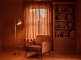
Before looking at a single color, it helps to decide how you want the room to feel, because that mood should guide everything that follows. Different colors evoke different atmospheres, with cooler tones tending to feel calm and restful, warmer tones feeling cozy and energizing, and light neutrals feeling airy and open. A bedroom you want to be a peaceful retreat calls for a different direction than a lively, social kitchen. Starting from the intended mood narrows the overwhelming field of options down to a manageable direction almost immediately.
Understand light and undertones
The most common reason a paint color disappoints is that people forget how dramatically light changes it. A color that looks perfect on a chip in the store can look completely different on your wall, because the natural and artificial light in your specific room transforms it throughout the day. Every color also has undertones, subtle hints of other colors beneath the surface, which is why one white can feel warm and creamy while another feels cool and stark. Paying attention to how a color behaves in your actual space, at different times of day, is what separates a choice you love from one you regret.
Think about flow between rooms
Rooms are rarely experienced in isolation, so it helps to consider how colors work together as you move through your home. Choosing a cohesive palette, where the colors of adjoining spaces complement one another rather than clash, creates a sense of harmony and flow that makes the whole home feel intentional. This does not mean every room must be the same color, but relating them thoughtfully, perhaps through a shared undertone or a consistent family of tones, ties your home together in a way that feels considered and calm.
Test before you commit
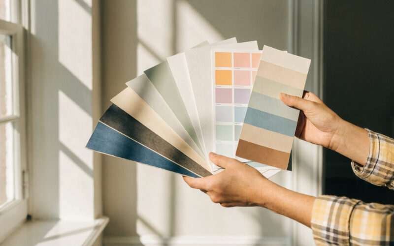
If there is one non-negotiable rule of choosing paint, it is to test your colors before painting the whole room. Buy sample sizes and paint large swatches directly on your walls, then live with them for a few days, observing how they look in morning light, afternoon light, and evening lamplight. Colors shift so much across these conditions that a shade you loved at noon may feel wrong at night. Testing in your own space, on your own walls, removes almost all the risk from the decision and is worth the small cost and short delay every single time.
A safety note for older homes
Before you start scraping or sanding in preparation for painting, there is an important safety consideration for older homes. Houses built before the late nineteen seventies may contain lead-based paint, which is hazardous when disturbed, so it is essential to understand safe practices before you begin. The Environmental Protection Agency at EPA.gov provides authoritative guidance on identifying and safely handling lead-based paint, which is well worth reviewing if your home is older, both for your health and your family’s.
Frequently asked questions
How do I choose a paint color for a room?
Start by deciding how you want the room to feel, since mood narrows your options quickly. Consider how light behaves in your specific space and pay attention to undertones, then think about how the color flows with adjoining rooms. Most importantly, test large swatches on your actual walls and observe them at different times of day before committing to the whole room.
Why does paint look different on my wall than the sample?
Because light dramatically changes how a color appears. The natural and artificial light in your room, which differs from the store and shifts throughout the day, transforms a color from how it looked on a small chip. Undertones also become more apparent on a large surface. This is exactly why testing large swatches in your own space, at different times, is essential.
What are undertones in paint?
Undertones are the subtle secondary colors beneath a paint’s main hue, which is why two whites can feel completely different, one warm and creamy, another cool and crisp. Undertones strongly influence how a color reads in your space and how it pairs with your furnishings. Noticing them, especially by testing on your walls, helps you avoid a color that clashes unexpectedly.
Do I need to worry about lead paint when repainting?
If your home was built before the late nineteen seventies, it may contain lead-based paint, which is hazardous when disturbed through scraping or sanding. Before prepping such surfaces, review safe practices from an authoritative source like the EPA. Taking the proper precautions protects your health and your family’s, and is an important step many people overlook when repainting older homes.
Paint with confidence
Choosing paint colors is not a mysterious talent reserved for designers. By starting with the mood you want, respecting how light and undertones behave in your home, considering the flow between rooms, and always testing before you commit, you can pick colors you will genuinely love. And if your home is older, take a moment to handle any lead-paint concerns safely first. For more ways to refresh your space, see our guides to small living room ideas and DIY home improvement projects. Find more in the Interior section.